Our web authors love icons and for the longest time they inserted them as icons that they found from google searches. Our designer would design custom icons for sites and they would be converted to svgs and placed in the page. Both of these solutions worked but were clunky. Luckily, icon fonts and icon sets have been popping up which provide end users an array of icons to use on their pages.
Non-content tag’s in WUSIWYG editors
The biggest challenge with inserting icons into a WYSIWYG interface is that they are usually only code and don’t render until after you preview the page. Most icon code looks similar to this:
<i class="material-icons xl UNC-blue">assessment</i>
In this example, the word assesssment would be written on the page without any context. Within the WYSIWYG editor, a user could get stuck within the tag and could be difficult to get out of. Typing content inside the tag would be hidden by CSS.
Table Transformations
OU Campus users are familiar with table transformations as it allows users to create tab navigation, accordions and other content structures where some of the content may be hidden when the page loads. This solution works great in edit mode because the web author can edit all of the content on the page. If your installation was like ours, you may have the ‘Place cursor at the end of this sentence to add more content’ content which helps with the cursor issue in WYSIWYG editors with tables.
Image Transformations
I’d like to introduce the concept of an image transformation for icons. The benefit of using an image instead of a table is that the tag is inline so icons can be placed with content. When the user inserts and image with a specific class to the page, it gets converted into an icon.
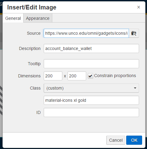
In the picture above the source of the image is a placeholder, it doesn’t matter what image this is because it will be replaced using XSL on preview and publish. (The source could be a dependency tag if the image was within OU but this image will never get served to the public.)
The description is the one of hundreds of icons that could be inserted. This demo uses Google’s Material Icon set but any icon set would work.
Class is the additional classes that the tag needs to render out the icon. material-icons is the parent class that is used by Google and will be searched for in the XSL match below. xl is the size (extra-large) and gold is the color of the icon. The Dimensions are also added but this only effects the editor.
After hitting [OK], the WYSIWYG editor puts an image in the editor that we can edit just like an image:
<img class="material-icons xl gold"
	src="https://www.unco.edu/omni/gadgets/icons/img/placeholder.svg"
	alt="account_balance_wallet" width="200" height="200" />
HTML Transform!
On preview and publish the image needs to be replaced with the icon code. A simple template match to find the class .material-icons will work:
<!-- Convert img to icon -->
<xsl:template match="img[starts-with(@class, 'material-icons')]">
  <i class="{@class}"><xsl:value-of select="@alt" /></i>
</xsl:template>
So you expect web authors to remember all these steps?
This solution works great if you follow these steps and know the short code for each icon. Expecting web authors to know this and go through the process each time is not reasonable. This is where the Material Icons Gadget comes in! With a side bar gadget, the user can select their icon, size and color from dropdowns and then insert the code into the editor. The only downside is that when they are in edit mode they see the placeholder image.
Install
Take a look at the Readme file at the root of the GitHub repository for detailed instructions. CSS for the icon set, colors and sizes needs to be added. The XSL transformation needs to be applied and the gadget needs to be installed.
Final Thoughts
Google’s icon set was used here but any icon set could work. In fact the gadget could be expanded to provide multiple icon sets for users. If you feel like contributing, please do on Github!