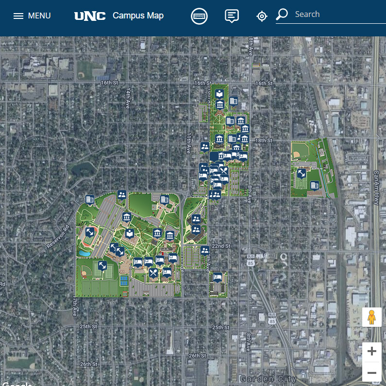
The new version of the University of Northern Colorado’s Map has launched! It includes many improvements over the previous version that I developed in 2008. We commissioned Map Formation to design an illustrated drawing of the campus that could be overlayed on top of Google Maps or OpenStreetMap. Using the Adobe Illustrator file they provided, I coded out the new map.
Previous Map
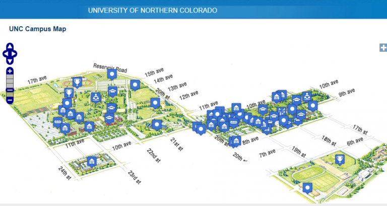
In 2008 I built out the previous Map for the University of Northern Colorado which, at the time, was nice and functional. However, over the years there were major issues with maintaining the content and usability. The content was maintained in a SQL database and was managed by a web interface.
The biggest issue with the old map was wayfinding. North was not the top of the map rather the right corner. The illustration of the map was designed this way so it could be placed on a single page spread in a printed vide book. This was fine for print materials when they were marketing the campus but hurt wayfinding.
The New Map’s User Interface
I borrowed elements from Google Maps for the user interface. Google has done a large amount of research in user experience so the “Card” layout was borrowed from them. Each clickable feature on the map has the option of showing a “card”, photo, or 360. Most features display a card which has information about the item including a photo or video, photo gallery, a text description and up to four links.
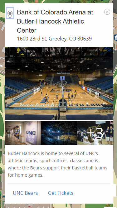
The example shown here is the Bank of Colorado feature card. The heading, image and gallery design is based on Google Maps.
Here are a few other features with options:
CMS Integration
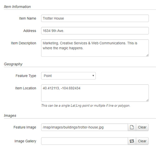
One of the requirements that I had when building out the map was that any user with permissions should be able to add and update features. Using our existing CMS, OmniUpdate, I created an interface with text-boxes for users to enter information for items on the map.
The CMS publishes out JSON files that the map uses to read the feature collections. The CMS makes it easy and quick to maintain the content behind each feature. If OmniUpdate wasn’t used, the features could be edited by a text editor or ported into a different CMS if needed.
As discussed above, each feature on the map can have multiple properties and media associated with it. The example here is about half the options that each feature can have. Other options include the feature’s icon, what happens when it is clicked, if it should be added to the search, and the links the card should have.
Each layer has a folder that keeps its features organized. If a new building or feature needs to be added, any user with permissions can click the new button and add the details.
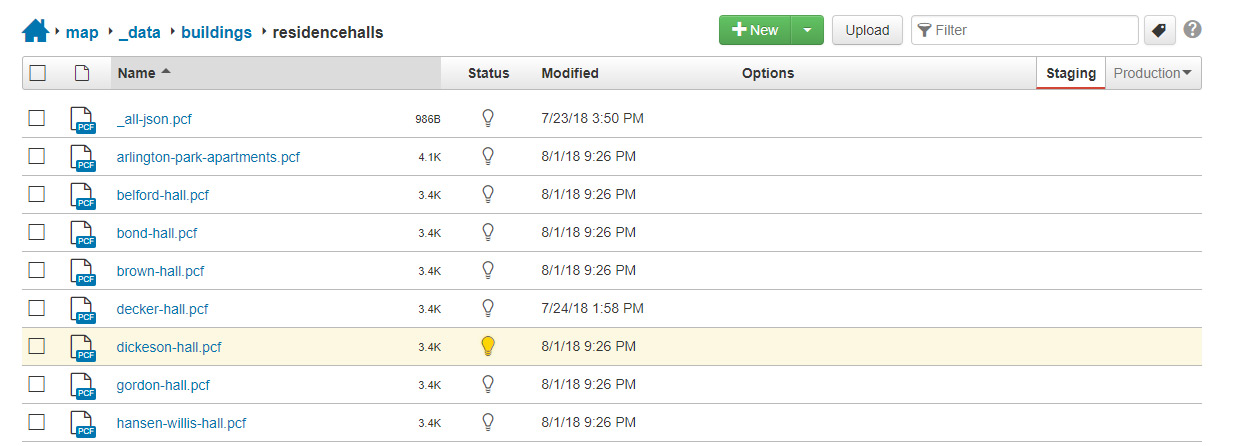
The top file _all.json.pcf loops through the files in the folder and creates a GeoJSON file that Google Maps can parse using the loadGeoJson() function. When a feature is clicked on, the information for that feature is called from its individual JSON file and loaded into the user interface.
Temporary Maps
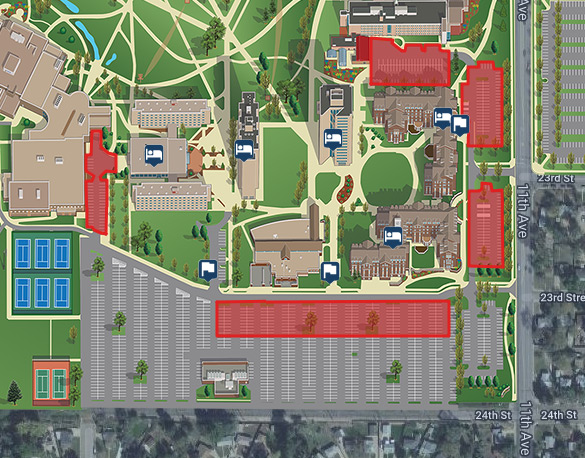
Another feature I wanted to provide was temporary maps that could be used short term for specific events. The first one that was launched was for freshman move-in day. For the event, some parking lots have 20-minute time restrictions and popup information tents are located around the campus.
Much more!
The map includes many other features and enhancements not mentioned here. Please play around with it and let me know what you think and if you have any questions.
Thanks!